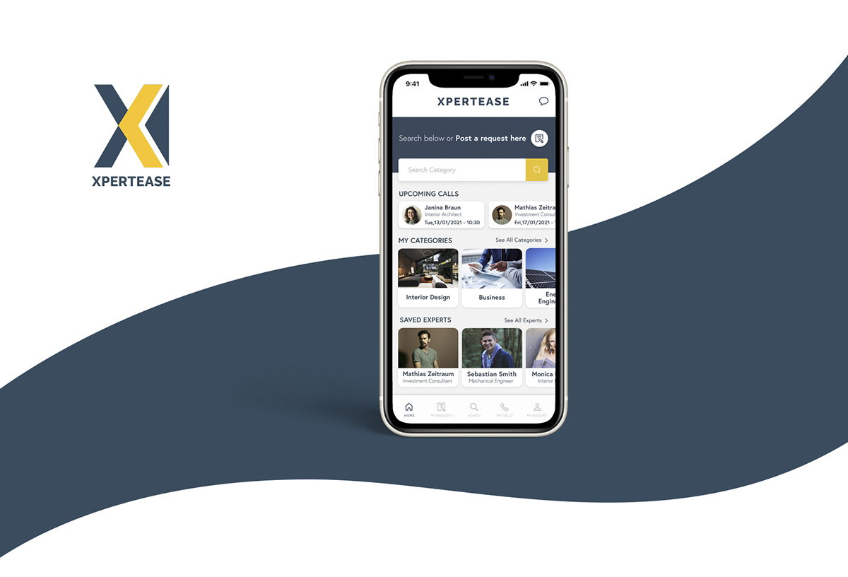
Objective
Design an App that connects advice seekers with Experts in order to get help virtually in nearly any professional field.
Context
We all need advice of an expert sometimes, and research takes a lot of time and can be frustrating. The goal of this app is to give people a simple, intuitive way to connect with an expert in nearly any professional field and schedule virtual appointments with them, in order to feel supported and easily find fast and accurate answers to their questions.
Project
The project brief was given by Career Foundry (UX Design Immersion course).
Role
I was a solo UX/UI designer and researcher.
Duration
5 months (2-3 times a week) October-February 2021
Tools
Adobe XD, Balsamiq, Ideate, Miro, Usability Hub, Optimal Sort
Design Process
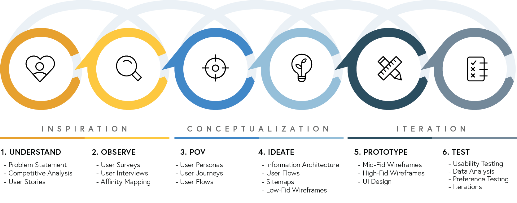
I followed an iterative non-linear process called ‘Design Thinking’ which helps empathize with the user, understand the problem and create innovative solutions to prototype and test, allowing me to improve the design through feedback and experimentation.
1. Understand
Problem Statement
Users need a way to quickly connect with certified experts on any professional field, because they need to find accurate and fast answers, feel supported and have the certainty that they can rely on it for any inquiry they have regardless the topic and how specific.
Solution
This app will allow users to quickly connect in their desired way with certified and trustworthy experts on any professional field, They will not only find fast and accurate answers to their specific inquiries, but also support along projects, being able to always rely on the professional advisory and having the opportunity to favourite experts in order to solicit further help.
Competitor Analysis
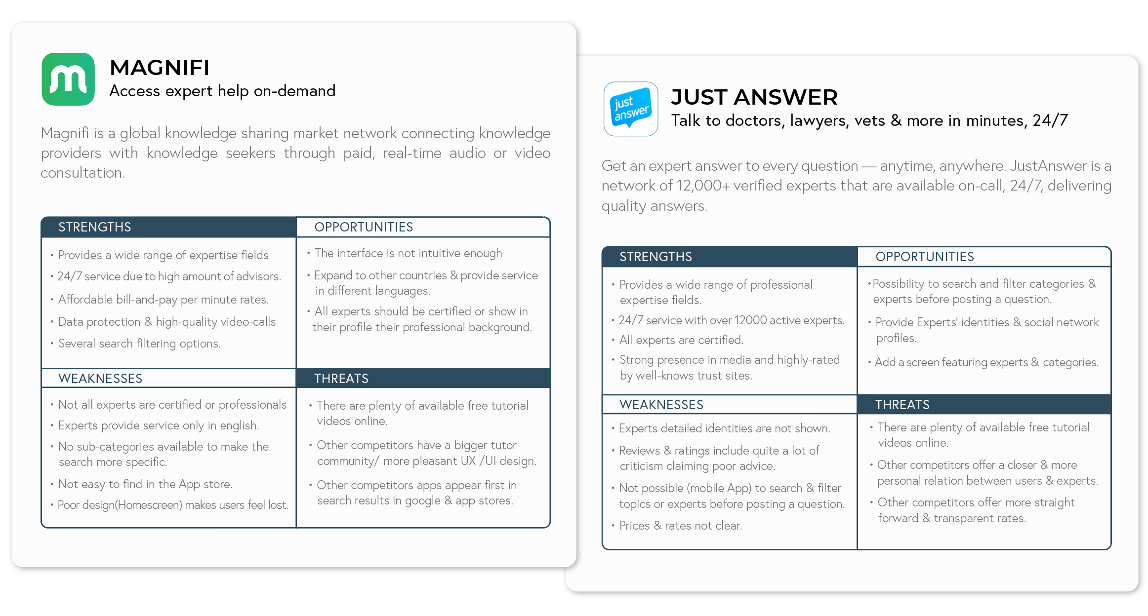
I proceeded making research to identify the already existing potential competitors in the market. I spent some time testing them, understanding and getting inspired by the solutions, services and features they offer. I chose two for further competitive anaylsis: MAGNIFI & JUSTANSWER
Conclusions
There are already a few web applications that provide instant virtual expert help. However there are currently no apps which entirely satisfy user needs. Mostly lacking of certain professional fields and categories, or available certified and highly qualified experts. There's an opportunity to fill the gap that the current market leave by creating an application that reunifies all features needed to satisfy our users main needs.
User Stories
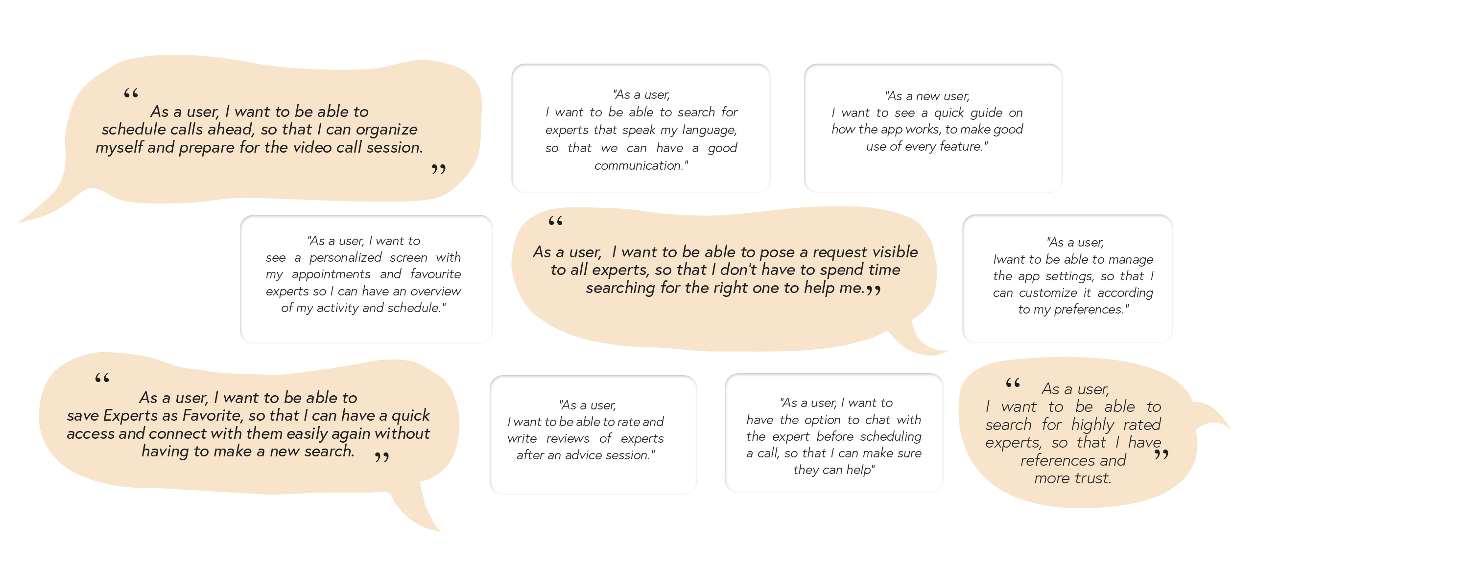
Research and the competitor’s analysis helped me understand better the requirements for my app. To visualize these better, I decided to simplify these down to small, readable executable parts by creating User Stories.
2. Observe
User Surveys
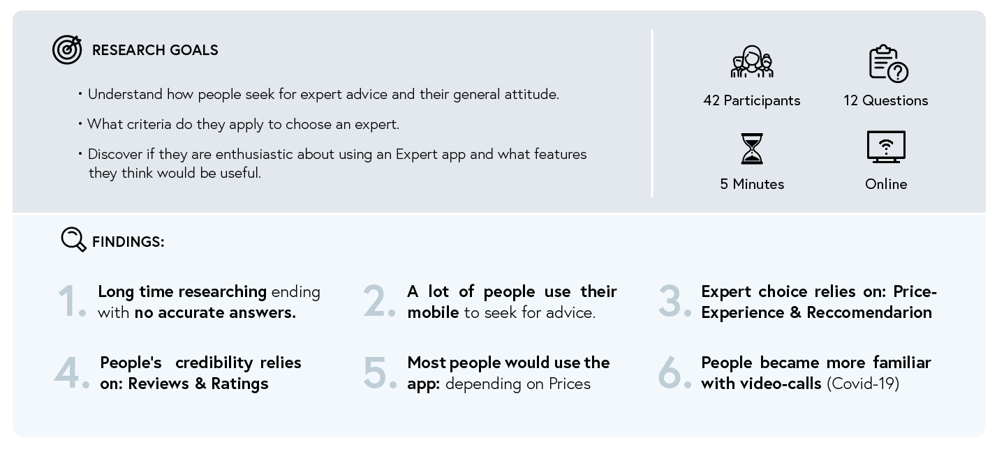
I started my User research creating an online Survey in order to collect quantitative data helping me understand how people seek for advice. Most of the participants were people between 25-44 years old matching the target group age.
User Interviews
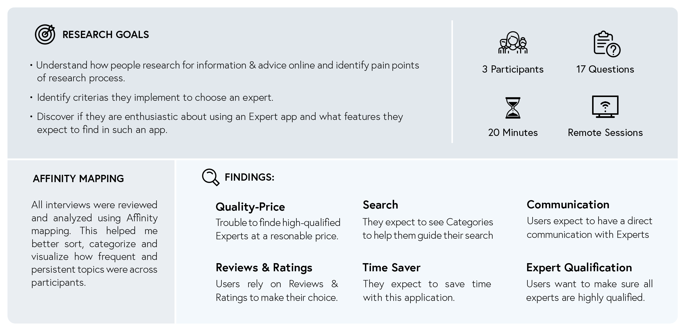
With the survey findings I could better define the right questions for my User Interviews. I conducted one-to-one sessions with 3 participants. I opted for more open questions in order to understand further users’ behaviours and attitudes as well as their needs, goals and frustrations.
3. POV
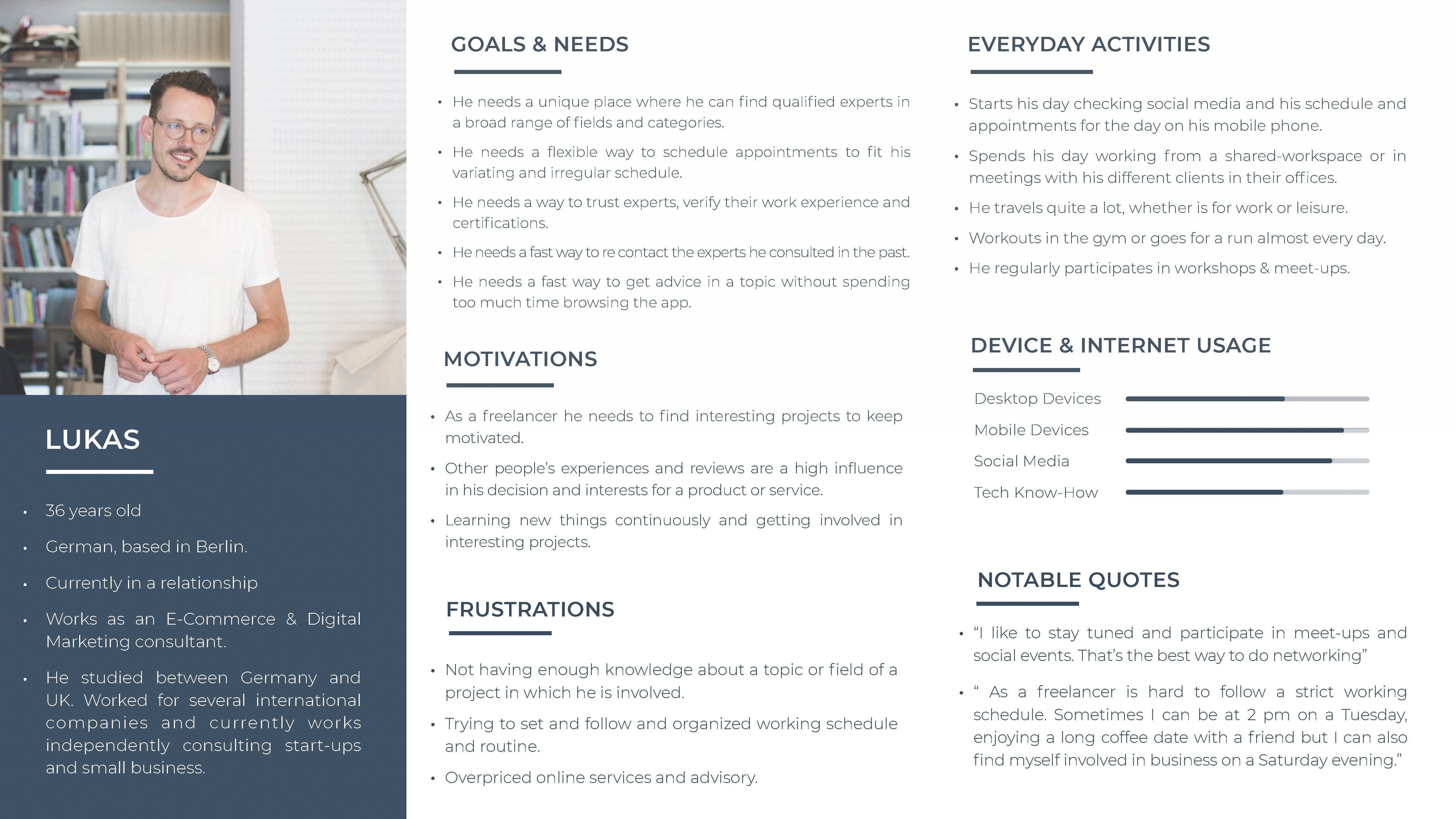
User Personas
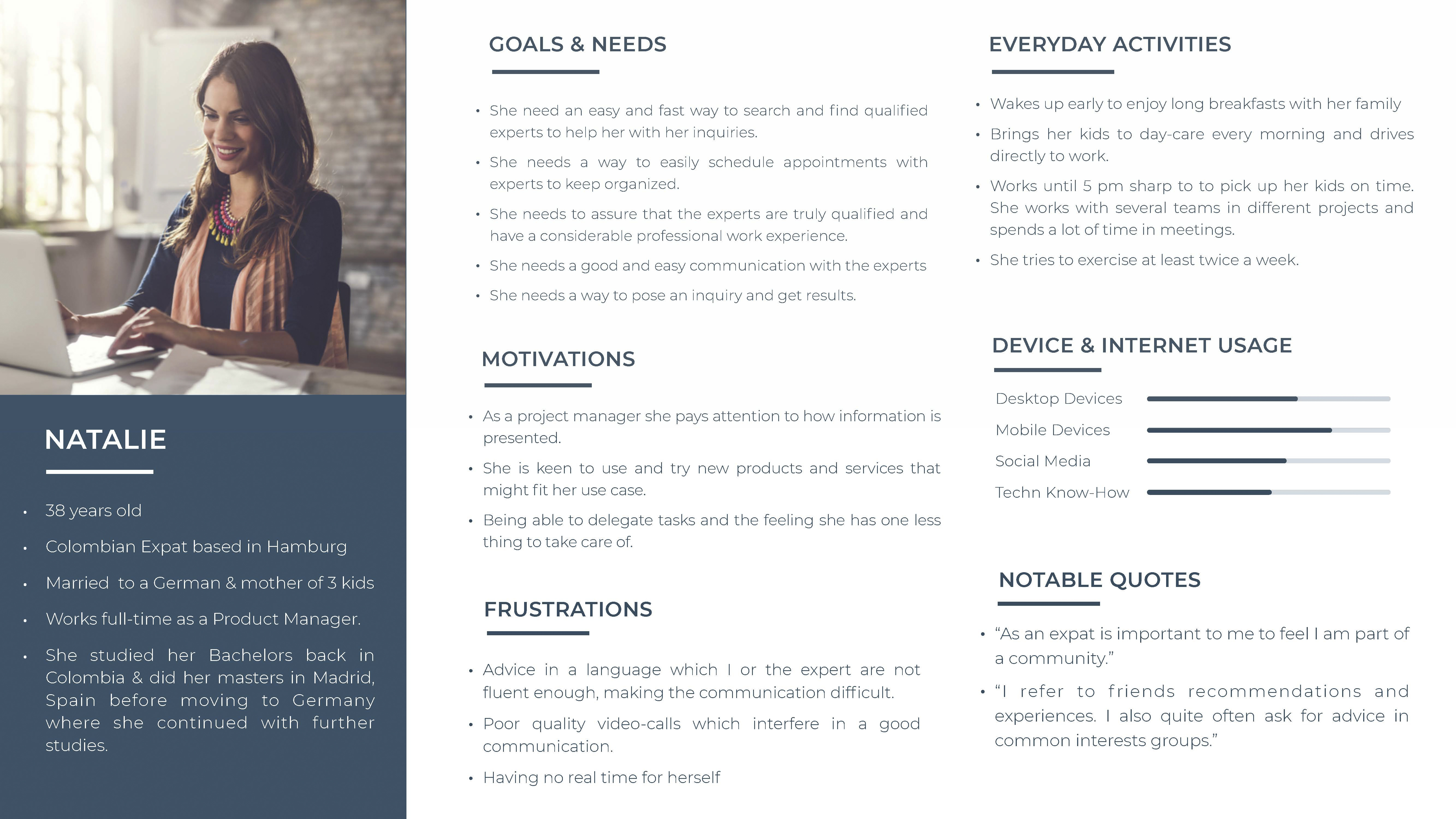
Based on all the data gathered in the user research process I create 2 reliable User personas which will help me understand better the user needs and goals, behaviours and expectations. Helping me keep focus throughout the design process.
User Journey
I created a User journey map for each persona so as to better visualize the processes a user goes through, in order to achieve a goal. These journeys combine a series of user actions into a timeline and the users thoughts and emotions creating a narrative.


User Flows
After analyzing and optimizing the tasks of the User Journeys, I created User flows to visualize the interaction of users with the application.


4. Ideate
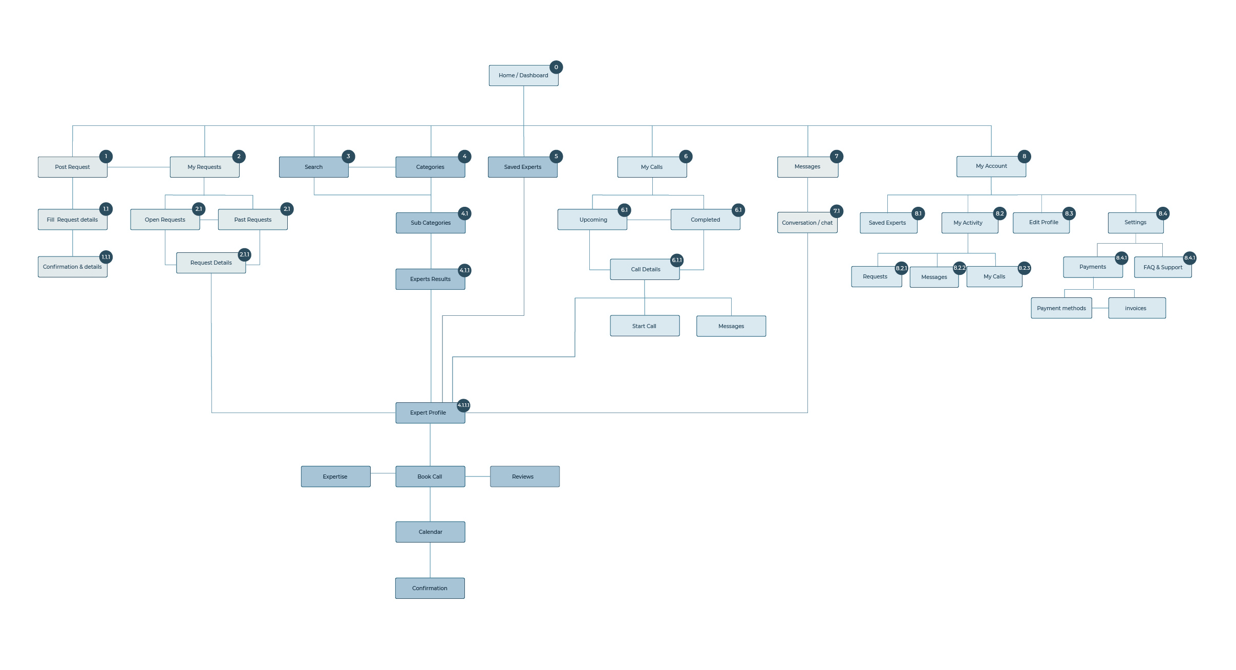
Sitemap
After visualizing User journey and Flows I created a Sitemap for the application. I conducted a closed card sorting with potential users in order to analyze and evaluate my hypothesized categorization and be able to improve and refine my Sitemap.
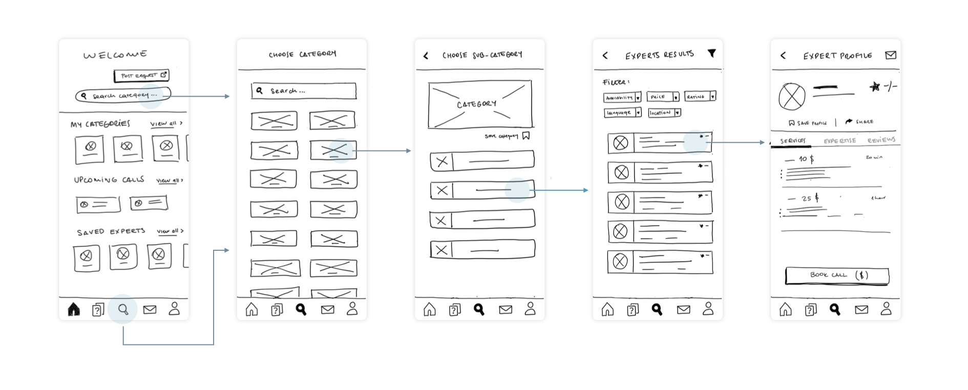
Low-Fidelity Wireframes
After evaluating and sketching different possible navigation solutions and considering design patterns for the app main features, I started to wireframe the first Low-Fidelity prototypes.
5. Prototype
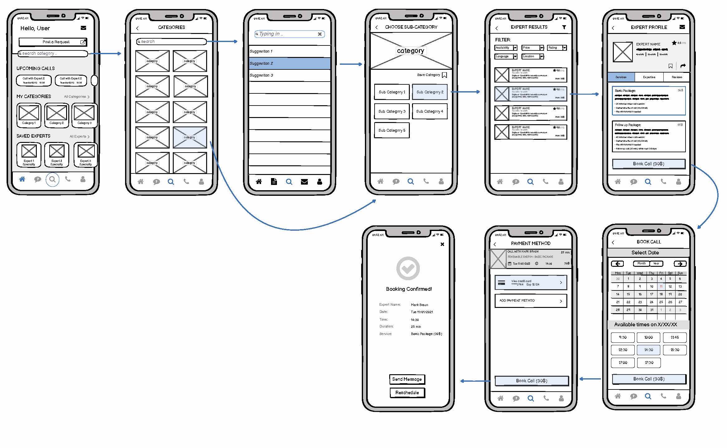
Mid-Fidelity Wireframes
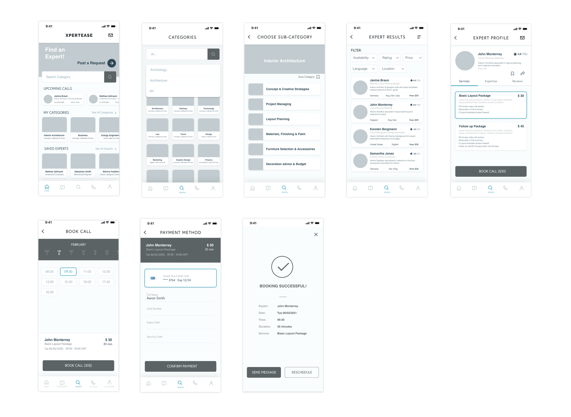
I progressed creating Mid-Fidelity wireframes which allowed me to in a very fast way easily communicate the overall idea of the app, its main features and the navigation through it. For this design phase I used the tool Balsamiq.
High-Fidelity Prototype
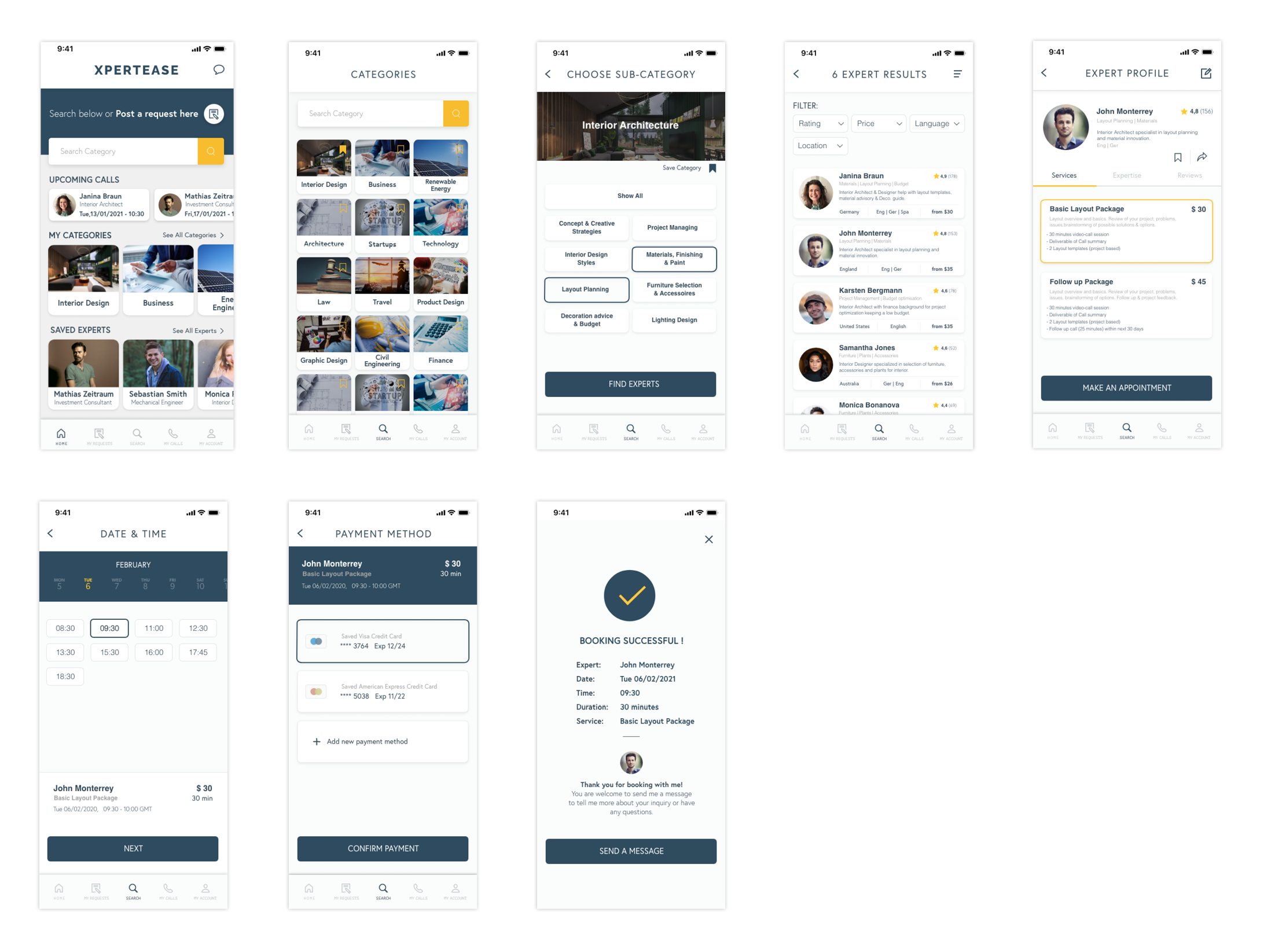
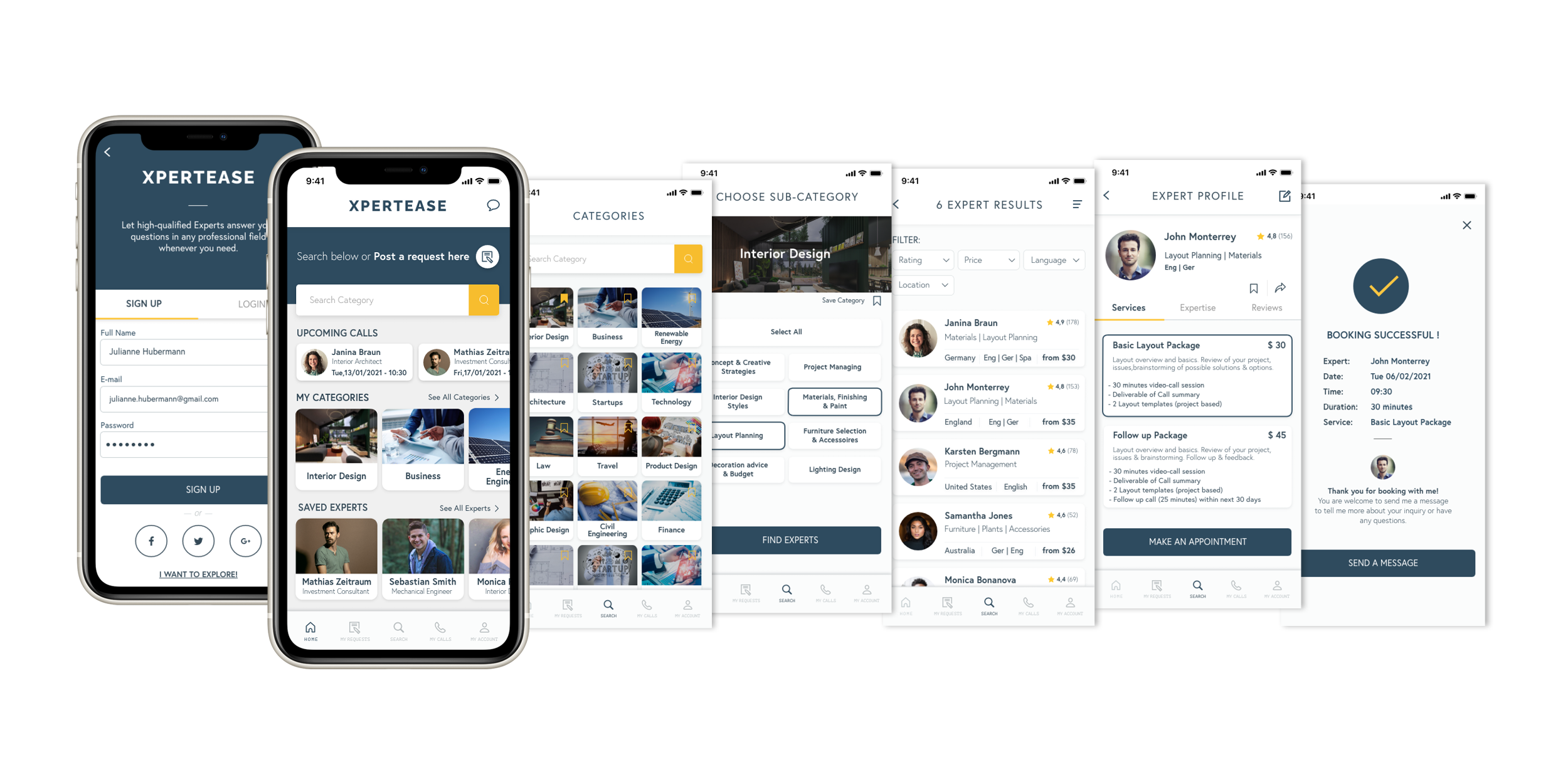
After revising the Mid-Fidelity wireframes and the main features flows, I created High-Fidelity wireframes which I connected in order to create an interactive functional prototype for 3 of the app’s main features and flows. For this design phase I used Adobe XD.
6. Test
Usability Testing
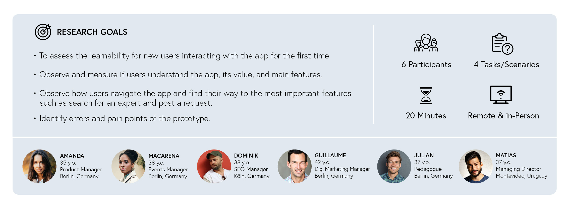
Once I had the Prototype ready, it was time to test it! I made a plan and created a test script to conduct 6 moderated (remote & in-person) usability tests. I asked the participants to try out my prototype and complete a few tasks using the app. These tasks were based on my user flows.
Test Report & Prototype iterations
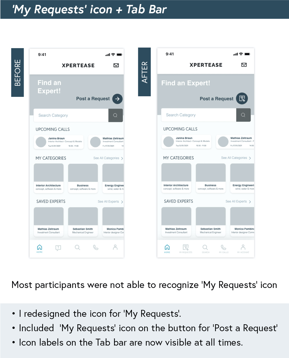
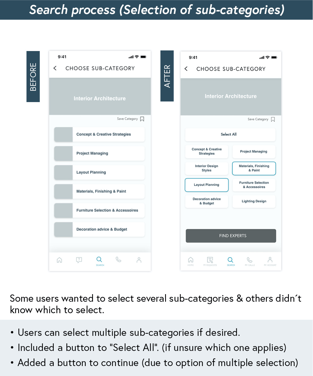
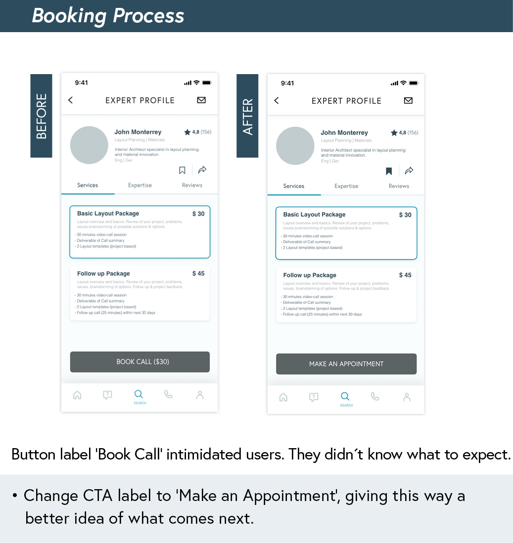
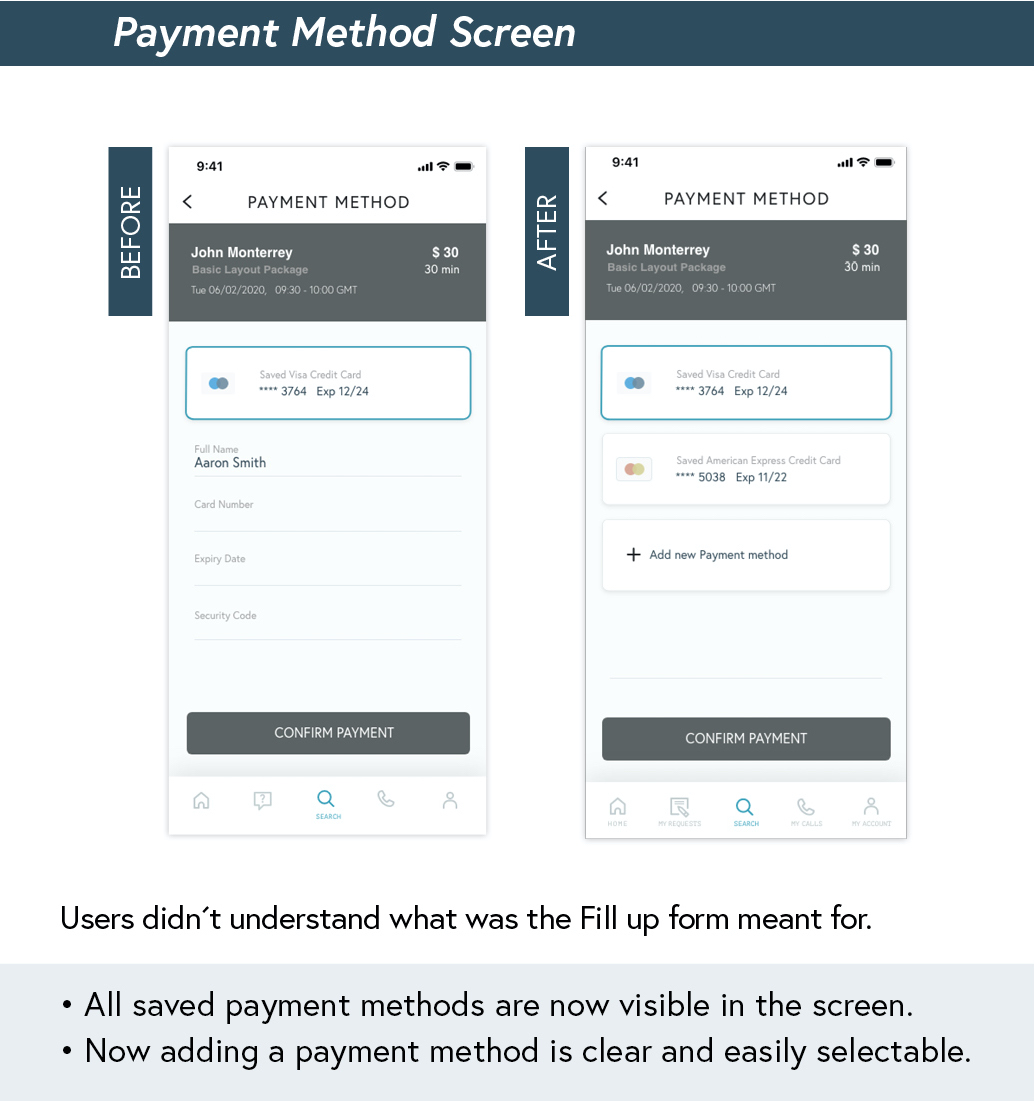
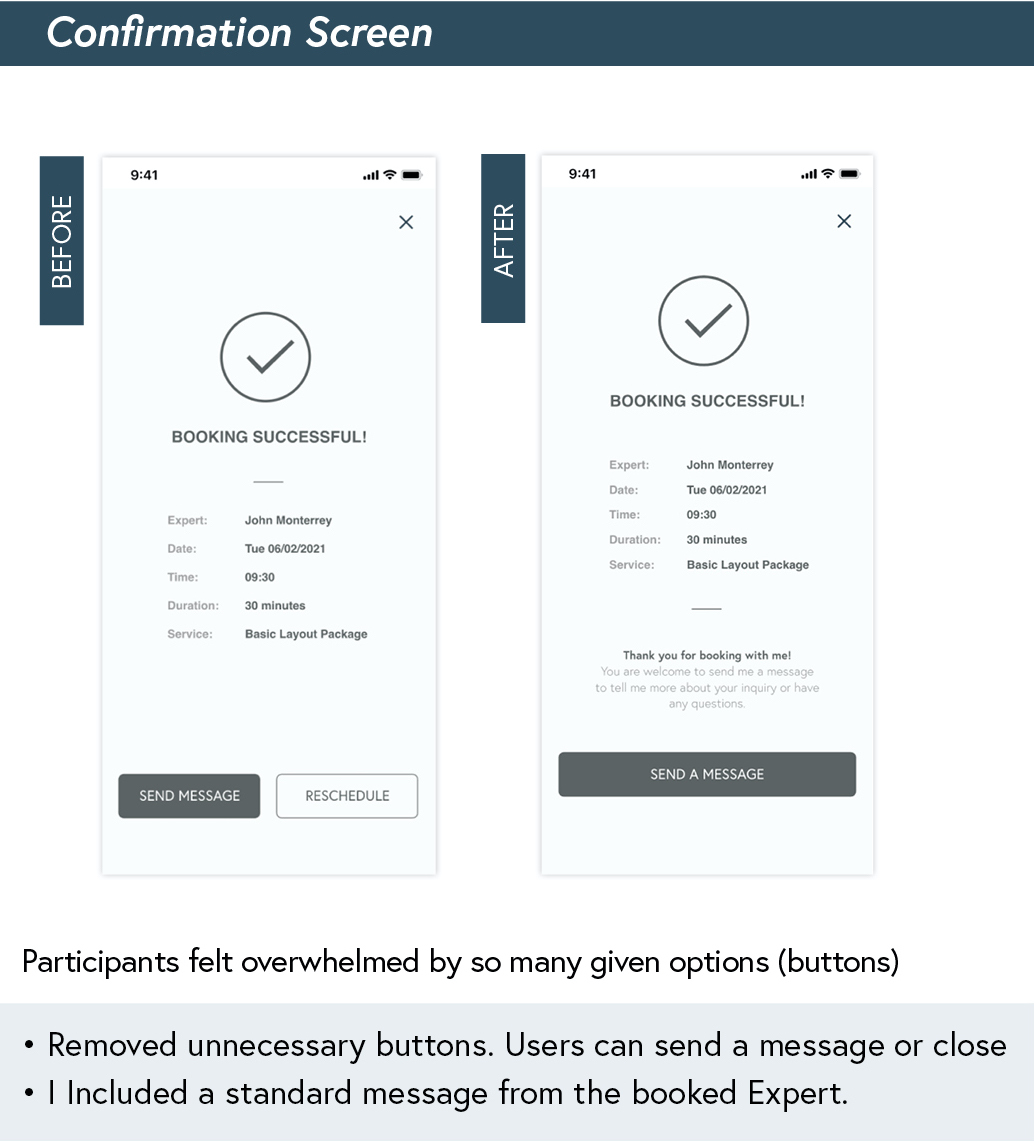
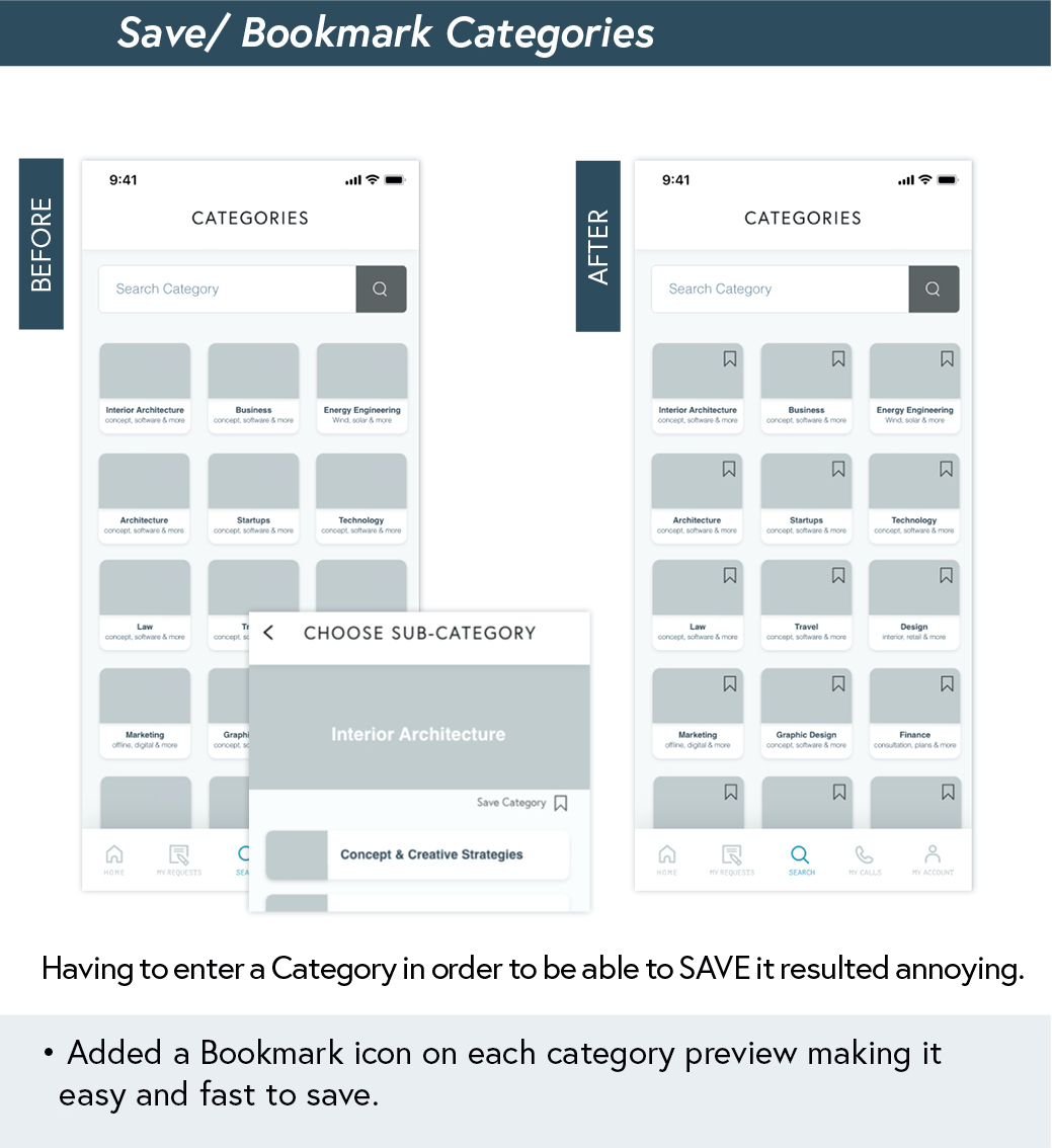
After conducting all six tests, I revised all the recorded sessions and went through the collected notes in order to define learnings and test results. All notes were sorted and organized in order to analyze the data creating a Rainbow SpreadSheet. With it, I was able to recognize positive and negative points, errors and possible solutions to improve my prototype.
Preference Test
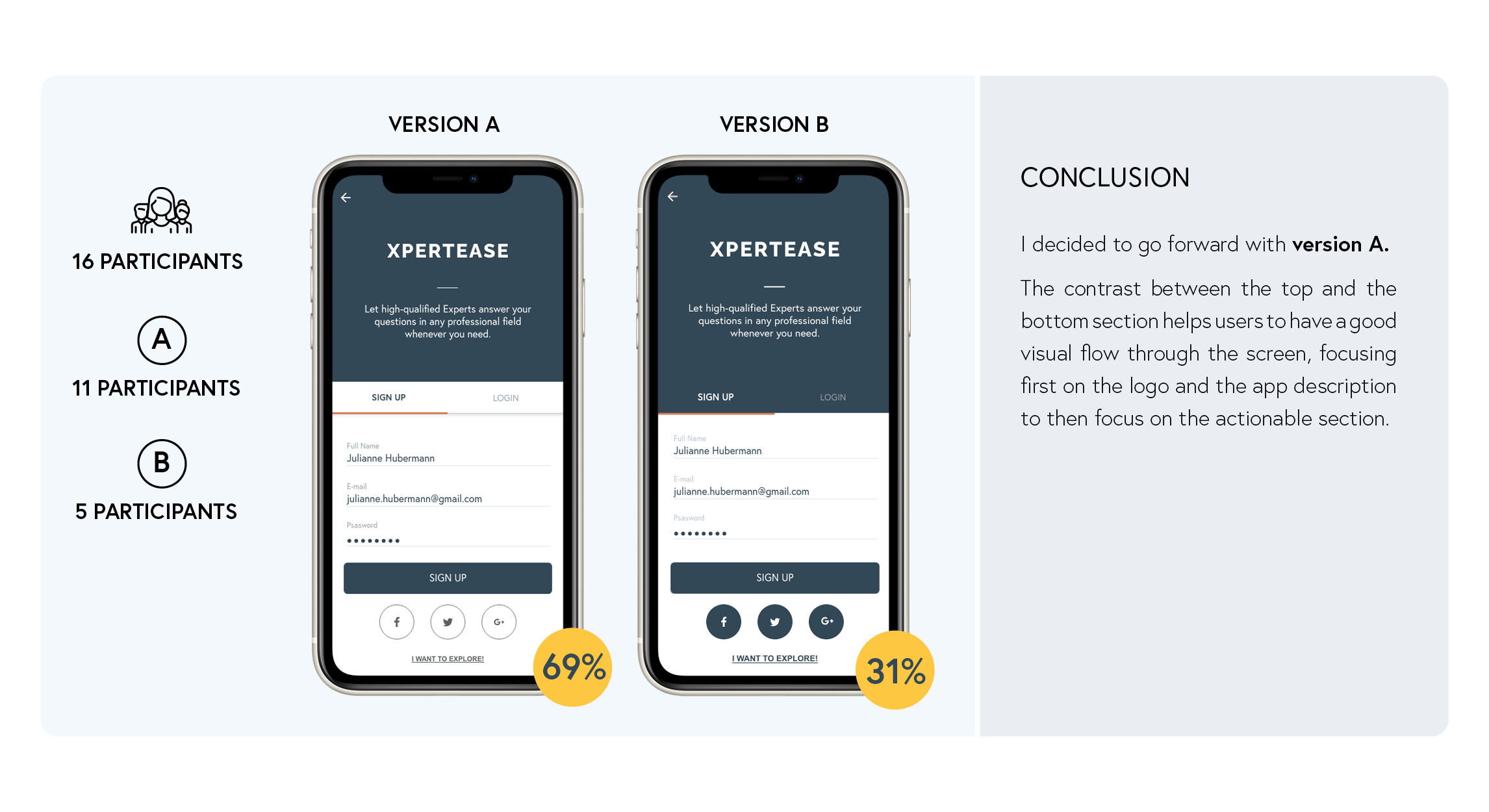
A preference test was made for the Login/Sign Up screen. I wanted to know which version participants preferred overall and the reason of their choice.Test results helped me make some design decisions on my prototype.
Refining the Design
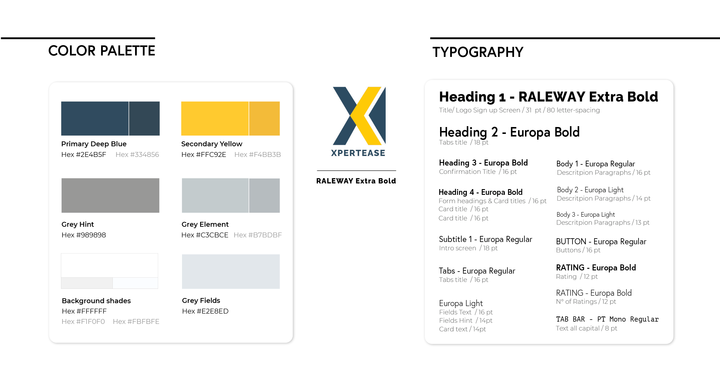
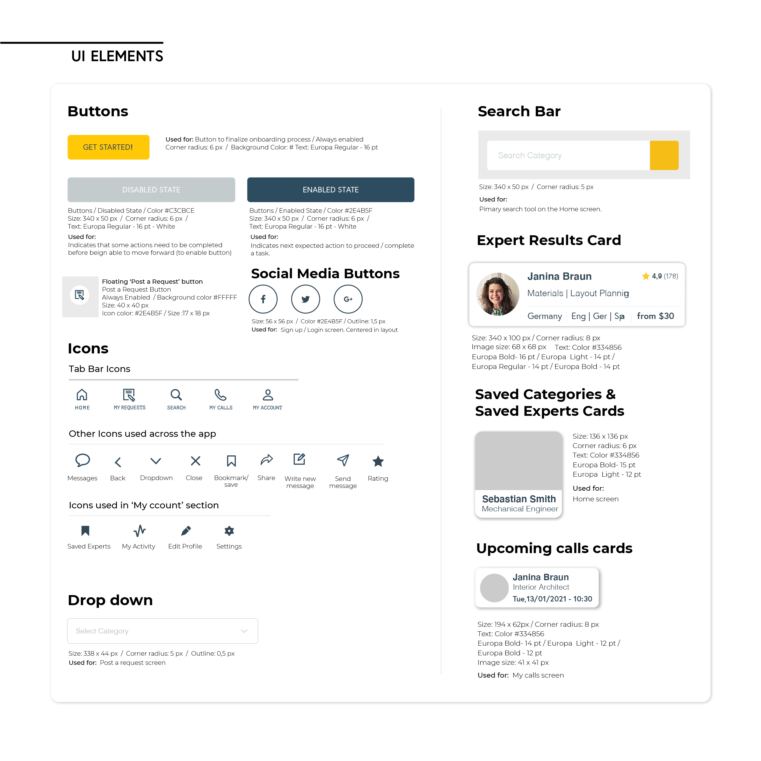
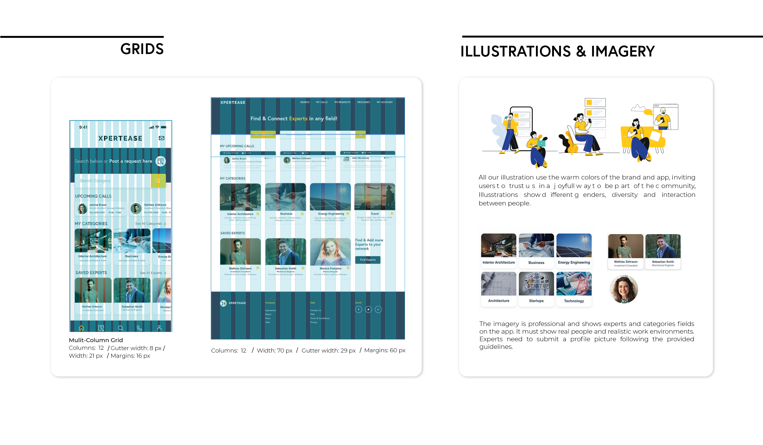
I continued working on the design, following some visual design principles and applying emotional design strategies across the app in order to get users engaged with the product. I adpated my layout to a multi-column grid and considered spacing fundamentals.
Design Documentation
Final Design
Reflections
What I’ve learned & challenges
The biggest lesson was to always be prepare for changes and ready to make improvements. It was challenging not to get too attached to the designs and experiences I was creating and accepting that when users don´t understand or present difficulties with it; it is the problem that’s not beign well solved and the product needs improvement. Another challenge I faced was conducting interviews and usability tests without influencing the participants in any way.
Next Steps
What can be improved?
I believe there is always room for further improvement. There are some specific improvements related to accessibility which still need some work. I would also like to improve the functionality and navigation of the prototype itself, in order to allow users to navigate more freely through the app and discover features and functions away from the current functioning flows.
Further Development & Design
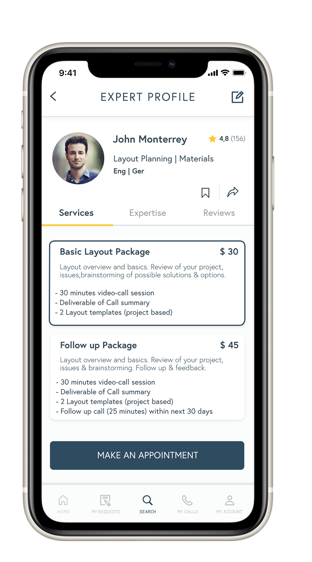
I think that the Expert Profile screen could be improved by designing the remaining sections which have not yet been designed. (Tabs: ’Expertise’ and ‘Reviews’). This way users will have a full view of all the information they can find in this screen and also will give me insights of how users navigate through it.
I would like to further develop the ‘Post a Request’ feature. Right now, users can see the Requests screen and post a request which involves filling up a form and submitting it; but it is not possible to access to the incoming responses or approaches from interested experts. I would like to go on and design a solution for how users choose between the available experts, their services and book a call.